Case study · Builder.ai
Block Design System
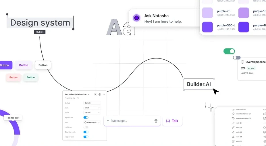
I led the Block Design System from audit to adoption, and got designers and engineers onto one tokenised foundation with code parity.
- Problem and role
- Builder.ai's products had drifted apart: duplicate components, a dated look and hard-coded values. As Design Manager I set the direction and partnered with engineering on code parity.
- Team and scale
- A working group of 5 product designers and 2 front-end engineers, reporting to the Head of Design. Jul 2024 to Sep 2024. Web.
- The idea
- Fix the foundations first, because they cascade into every product.
Outcome
32%
reduction in design review cycles
50%
faster implementation
The best design systems balance structure with flexibility.
Where to start
An audit before any components
I reviewed the component docs and the Figma library, sat in design reviews, and watched how designers and engineers actually used the system. Then I compared it with Material, Carbon and Lightning. The best systems balance structure and flexibility, with clear hierarchies, good documentation, governance and a tight link between design and code.
01
Inconsistent UI library
Siloed teams had made several button styles, navigation patterns and form inputs, which fragmented the experience.
02
A dated visual style
Colour contrast failed WCAG 2.1, and 42% of user feedback called the product outdated next to competitors.
03
No tokens
Hard-coded values instead of semantic tokens limited theming and made the system hard to scale.
Decision 01 · Structure
Mirror the code, atom by atom
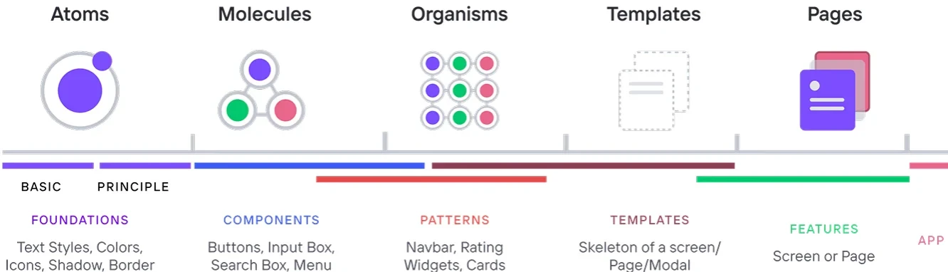
Following Brad Frost's Atomic Design, we built the smaller components into their own library and named the Figma pages to match the internal code repository. Designers and engineers looked at the same structure, with the same names.
Decision 02 · Foundations
Foundations first
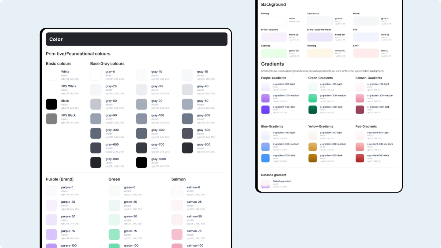
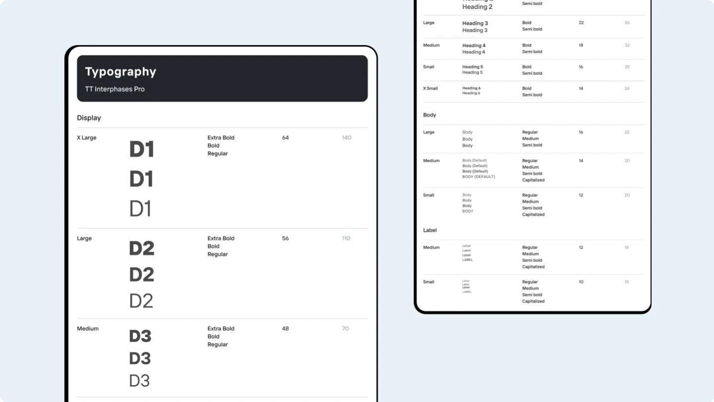
I centralised colour, typography and atomic components into one Figma source file, replacing a source of truth that had split across files. Working with engineering meant designers applied the right tokens, so reviews and handoffs got faster.
Starting here also let me run an accessibility audit early and land quick wins.
Decision 03 · Components
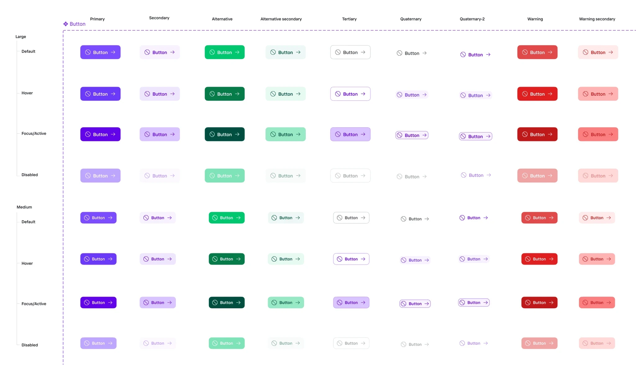
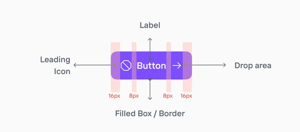
Components that compose
The hard part is not making many components. It is making them composable, while keeping Figma and code close even where they don't map one to one.
Decision 04 · Tokens
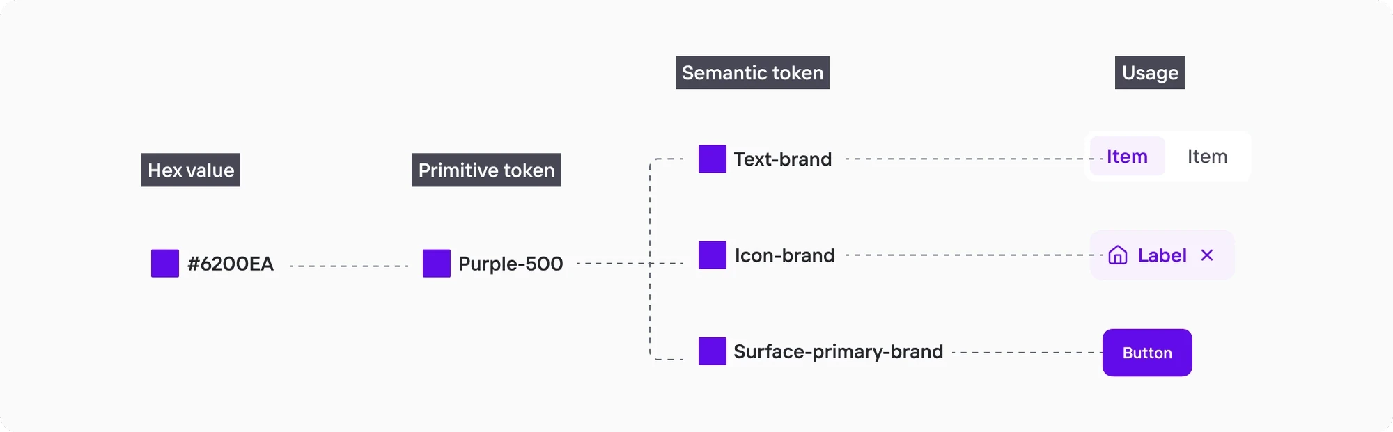
Name the purpose, not the hex
We moved to Figma variables and enforced semantic tokens. Instead of #6200EA, designers use names like Surface-primary-brand. That made intent clear to designers and engineers, cut maintenance, and opened the door to theming.
Decision 05 · Theming
One system, many themes
A proof of concept showed how variables and semantic tokens power theming far beyond colour and type. Designers could prototype new visual styles quickly, spin up brand and product themes, keep them consistent through central tokens, and update them in one place.
Results
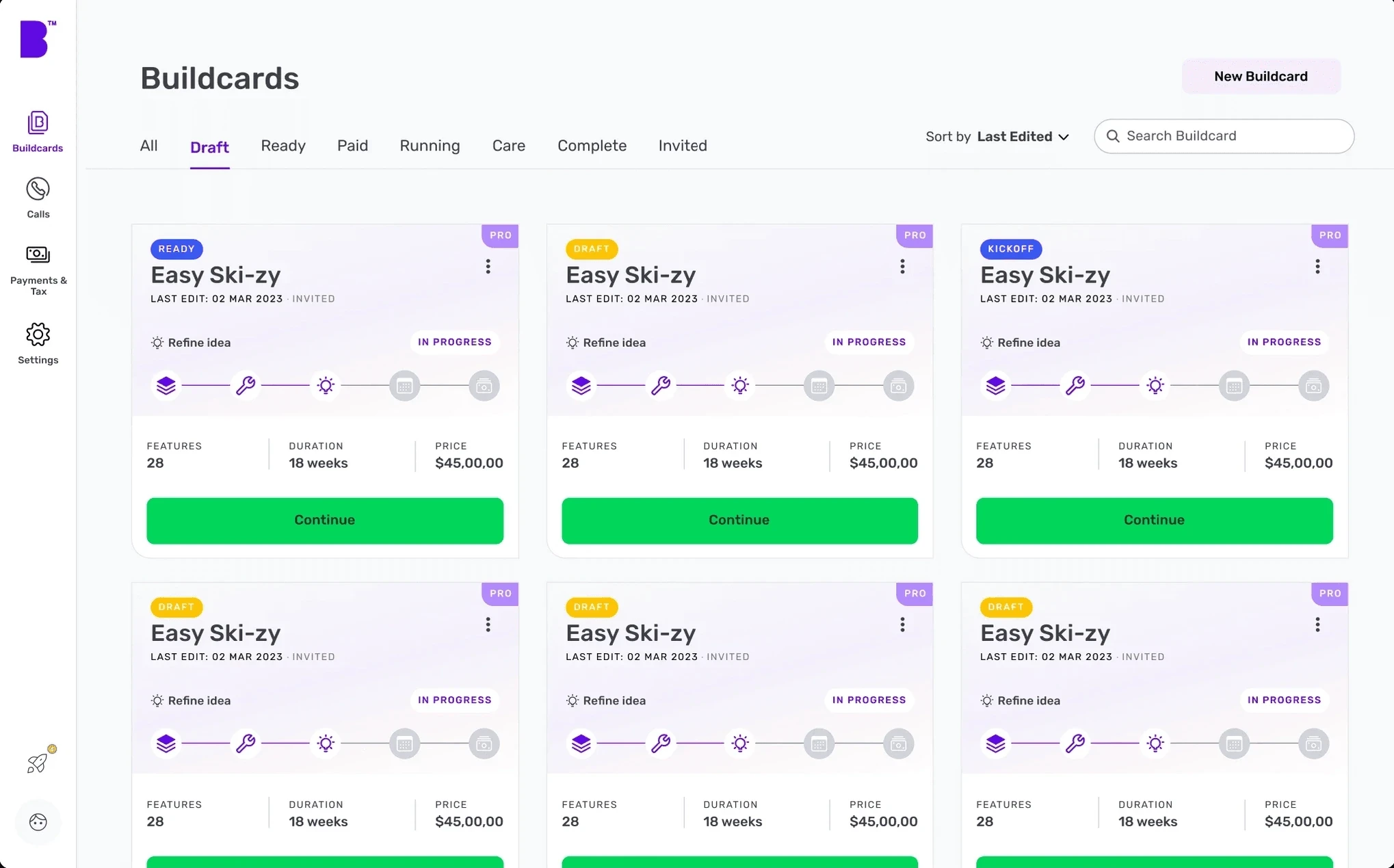
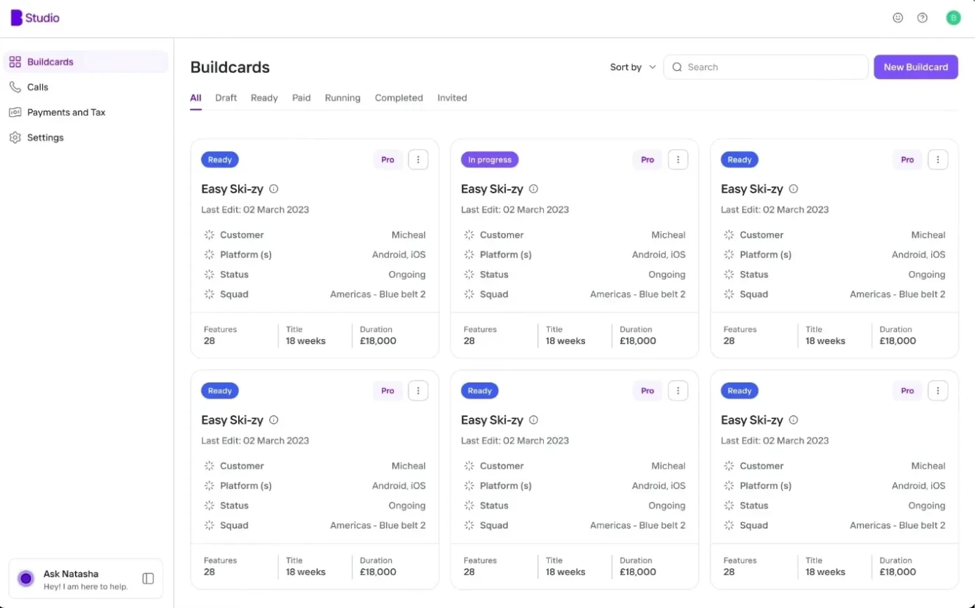
The system on a real screen
We applied the new system to a key product screen, the Buildcards list, to show the change in consistency, usability and clarity.
01
Consistency at scale
Shared colour, type and components reduced drift across products.
02
Faster design and development
Clear guidelines and semantic tokens cut review time and sped up handoff.
03
Accessibility from the start
Early audits of the foundations surfaced the key fixes.
04
Ready for theming
Variables and tokens set us up for multiple markets, clients and brands.
Next case study