Case study · Builder.ai
Builder Studio: talk your app into being
Natasha, a voice-first AI that lets non-technical people describe an app out loud and get ready-to-build requirements back.
- Problem and role
- Turning an idea into app requirements was full of jargon and usually needed an expert. As Design Manager I led the squad of product designers who designed Natasha.
- Team and scale
- 4+ of the 8 designers I managed worked on this flow. Jul 2024 to Sep 2024. SaaS, no-code and low-code. Live.
- The idea
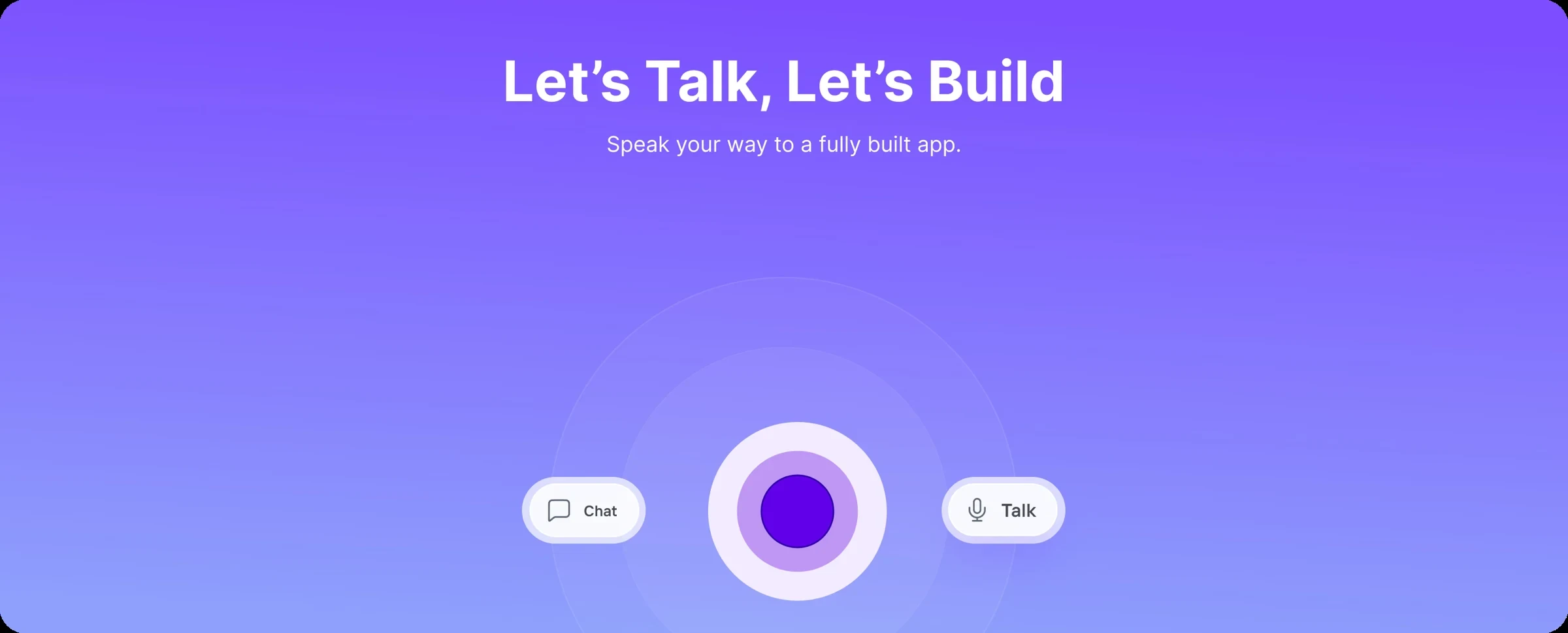
- Replace forms and jargon with a guided conversation, and let people speak instead of type.
Outcome
4+
product designers in the squad I led
Live
shipped in 2024
User feedback showed that speaking felt more natural than typing, so we built voice-first.
Speaking felt more natural than typing.
Problem
Typing out an app idea is hard
Non-technical users struggled to translate their ideas into app requirements. The process was complex, full of technical jargon, and often needed an expert to step in, which slowed the whole journey down.
Our research surfaced six pain points with the chat-based flow.
Incomplete information
People often left details out, which weakened the Buildcard they ended up with.
No natural flow
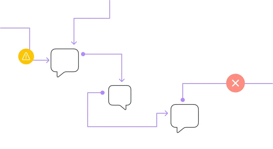
Typing doesn't recreate the back and forth of a real conversation, so detail gets lost.

Typing errors
Typos led the AI to misread input, which caused frustration and wrong responses.
Time consuming
Typing long, detailed messages is slow and tedious.
Monotonous
Text-only chat felt repetitive and impersonal, without the warmth of a voice.
Context switching
In text it is harder to multitask or jump between topics quickly.
Demo
See it in action
A walkthrough of the voice-first flow, from the first spoken idea to a Buildcard.
Research
What the existing experience got wrong
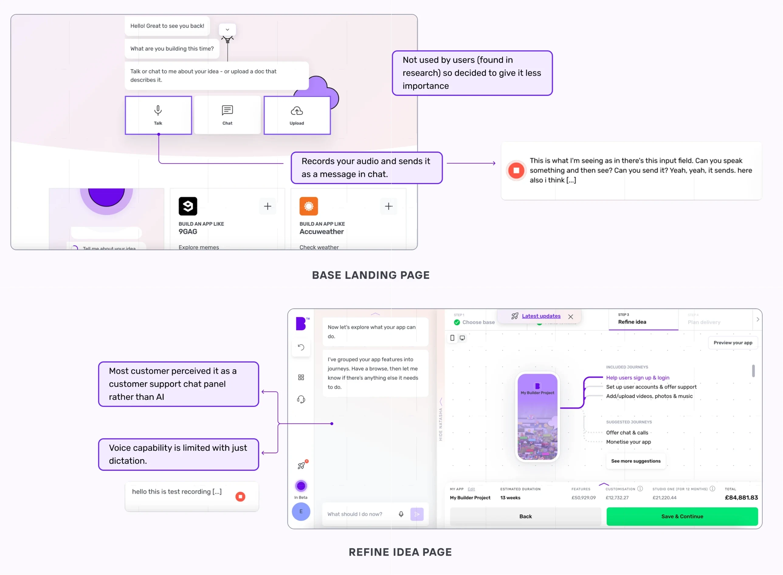
The old flow felt fragmented. Instructions were hard to follow, people jumped between steps and documents, and nothing guided their decisions. Research showed that upload was barely used, voice only worked as dictation, and most people saw the assistant as a support chat rather than AI.
Solution
Two shifts
We set out to make giving requirements feel like talking to a person, and to make what we captured more complete.
Decision 01 · Benchmark
Learn from the best conversations
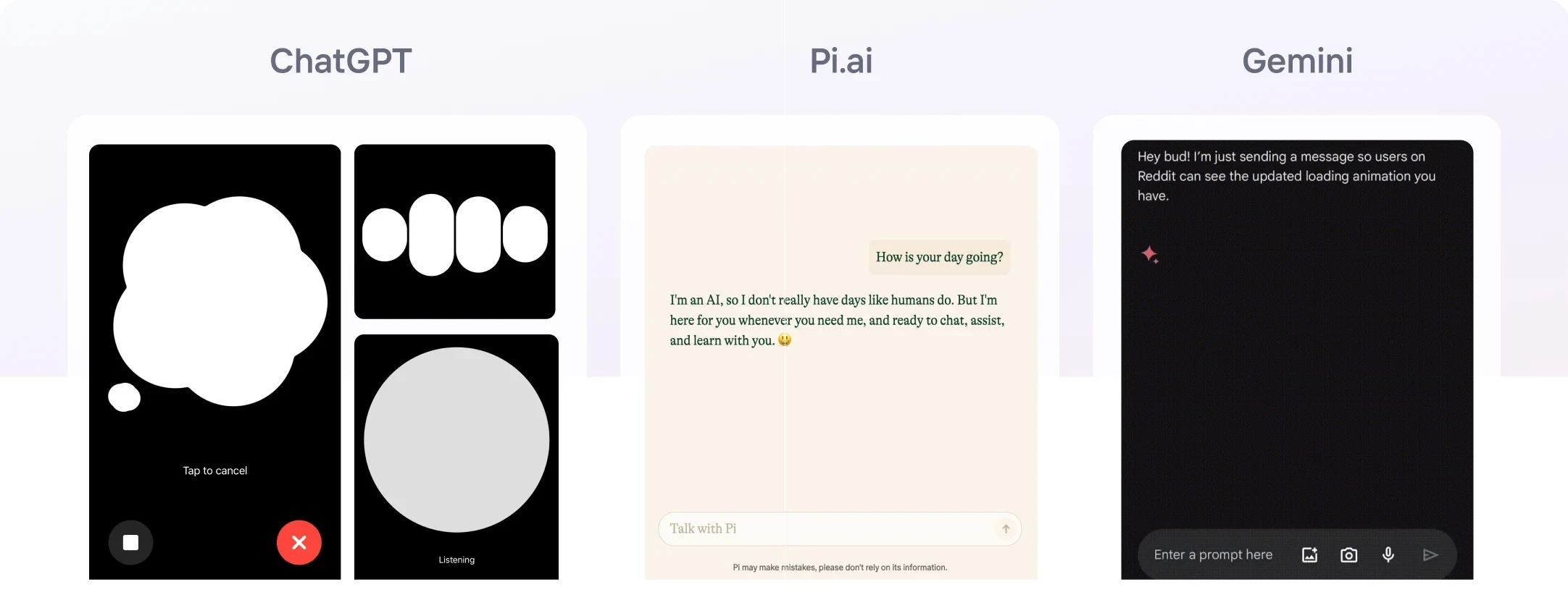
We benchmarked Gemini, ChatGPT and Pi.ai to see how each handles flow, engagement and moving between contexts.
- Gemini's strength with long-form conversation
- ChatGPT's responsiveness in real time
- Pi.ai's one-conversation-at-a-time clarity
Decision 02 · Input
Make voice the obvious choice
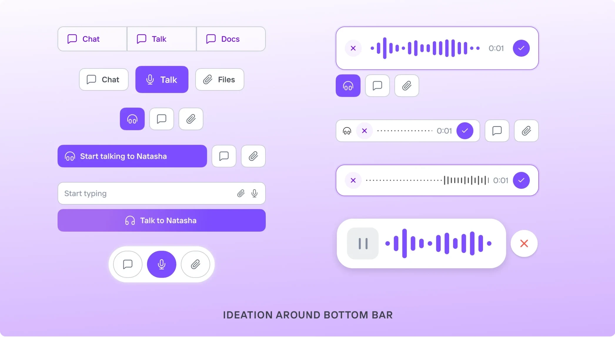
We explored many ways to bring talking, chatting and attaching files into one bottom bar, and gave voice the lead role, from a single Talk to Natasha button to a live waveform while she listens.
Decision 03 · Presence
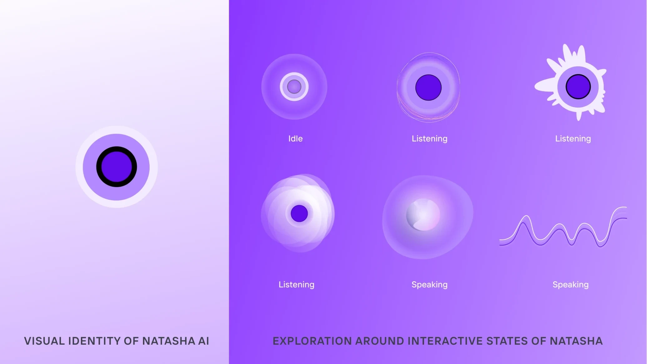
Give Natasha a presence, and a voice
We designed Natasha's states to mirror a real conversation, so people always know what she's doing: a pulse or waveform while she listens, a gentle loading cue while she thinks, and smooth, expressive motion while she talks.
We tested voices on Veed.io and picked one with the right mix of warmth and professionalism. Small human phrases like "That's a great idea" and "You're welcome" made her sound less mechanical.
In action
The platform, end to end
Key interactions and navigation in the final experience.
fig. 9a
Seamless move to voice
The homepage turns into a voice-first interface, with Natasha listening, thinking and speaking from the first moment.
fig. 9b
Explore your way
Talk to Natasha or browse freely. The interface shifts focus based on what you do.
fig. 9c
Interactive cards
Natasha shows short answers and actions as cards right inside the chat, so decisions stay quick.
fig. 9d
From conversation to exploration
A smooth handoff from the chat to a detailed product page gives more context without breaking the flow.
Launch
Live in 2024
Builder Studio shipped with Natasha as its voice-first front door, so non-technical users can talk an idea through and get ready-to-build requirements back, without expert help.
Reflection
What I learned
Voice feels effortless
We assumed people would prefer typing. Feedback showed that speaking felt more natural, so we went voice-first.
Design with mental models
People expect voice to work like a human conversation. Following familiar patterns from ChatGPT and Gemini made Natasha easier to use.
Collaboration makes it better
This project needed far more co-creation than usual. Brainstorming and constant feedback across the squad gave us richer ideas and a more cohesive experience.
Next case study