Case study · BlueStacksLaunched
BlueStacks website revamp
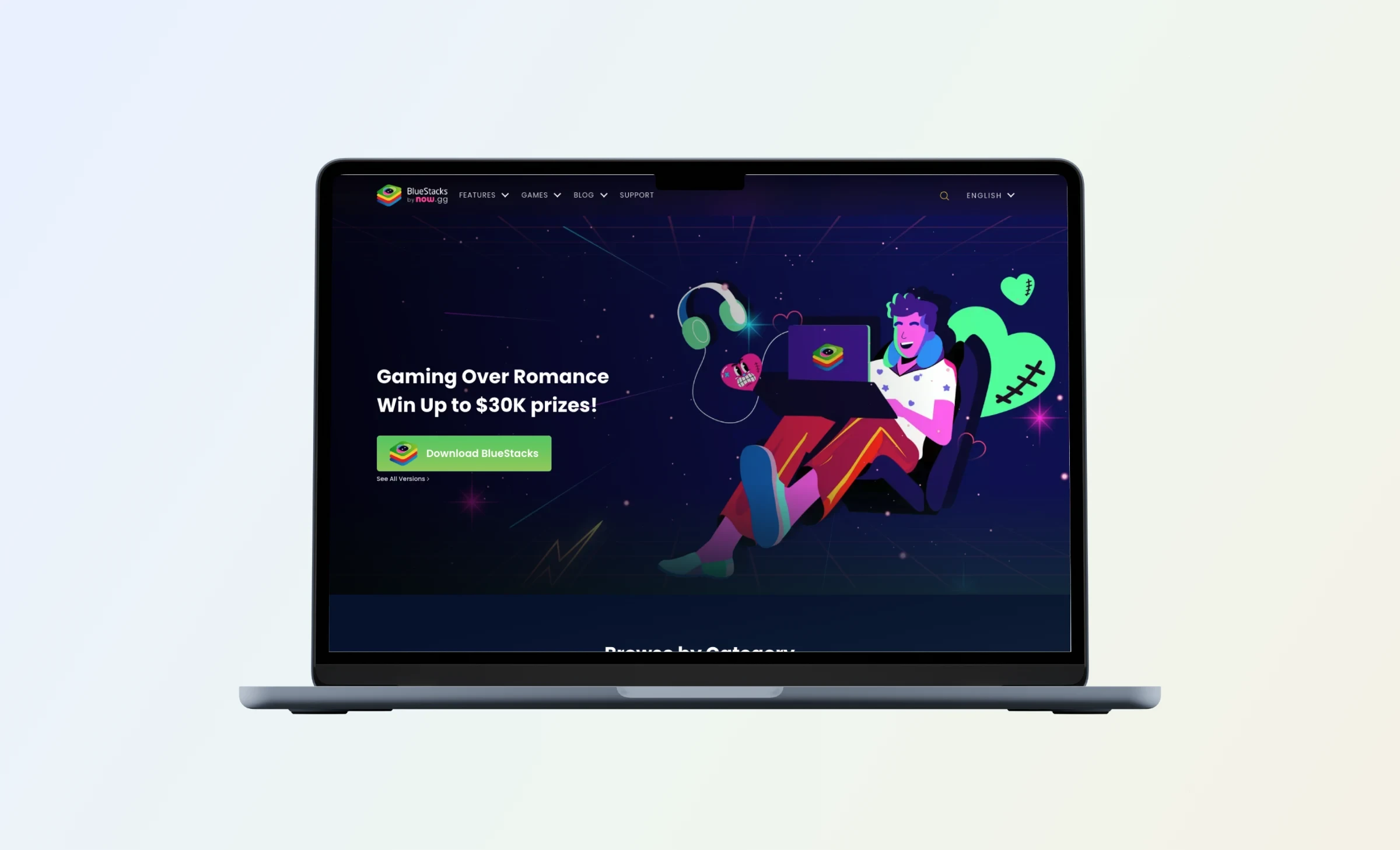
Rebuilding the BlueStacks website around one job: getting gamers to download App Player.
- Problem and role
- The site buried its download button under too much content and unclear navigation. As the only designer, I owned research, information architecture, UX and UI, and the style guide.
- Team and scale
- Me as Senior Product Designer, the Director of Marketing and 3 developers. Gaming, a consumer product with millions of monthly visitors. BlueStacks lets people play Android games on PC and has over 100 million registered users. 2020 to 2022.
- The idea
- Cut what distracts, keep the download in reach on every page, and give each kind of content its own place.
Outcome
32%
more App Player downloads in six months
25%
increase in user retention
84%
more time spent on the site
4.2
star rating, up from 3.2
The download button was there. People just could not find it.
Context
Too much, in no clear order
BlueStacks App Player lets people play Android games on their computer, and the website is where most of them download it.
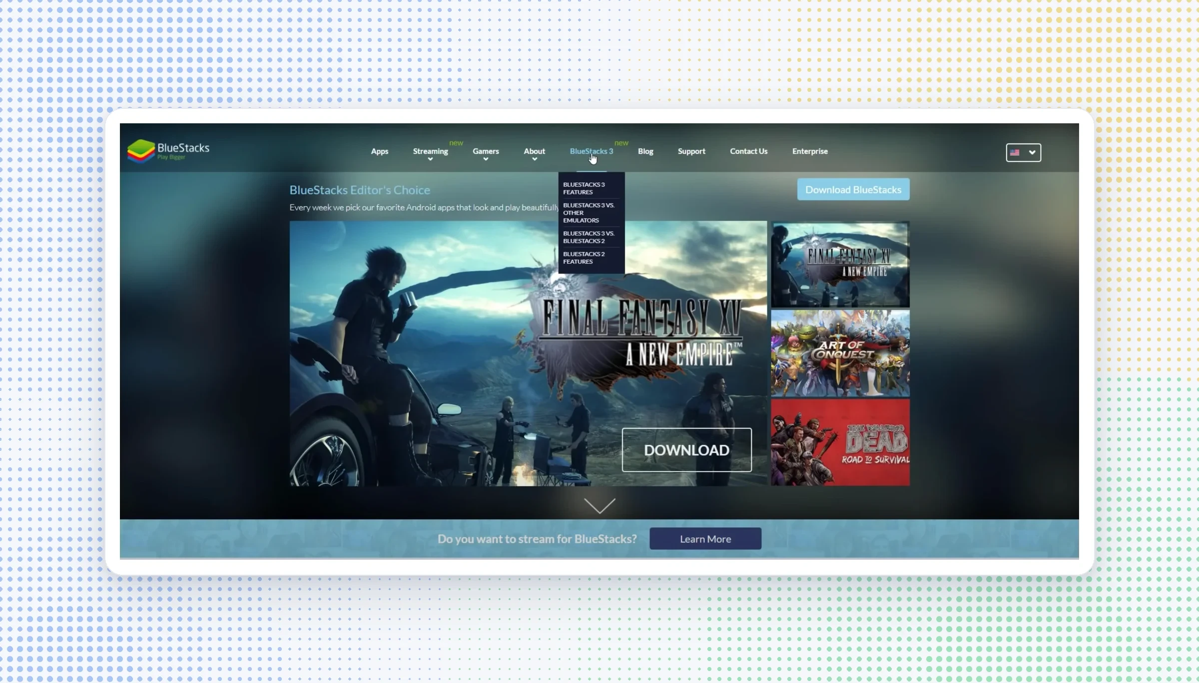
The old site overwhelmed visitors with information that had no clear structure. The download button lost visibility, the navigation was unclear, and long blocks of text were hard to scan, so people got distracted before they reached the one action that mattered.
Research
Finding the people who really want App Player
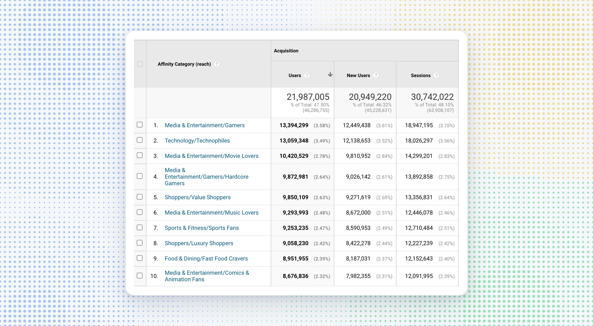
I combined analytics with interviews to find the people who actually want to use App Player.
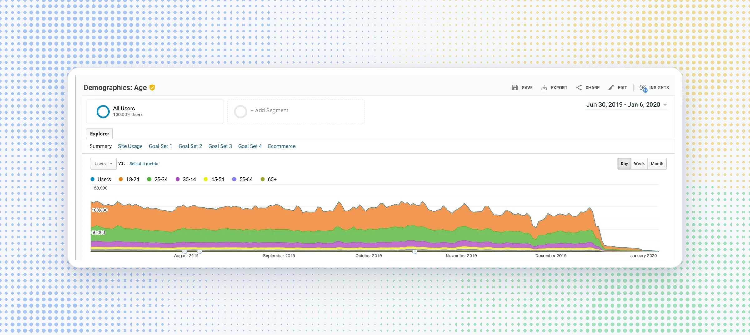
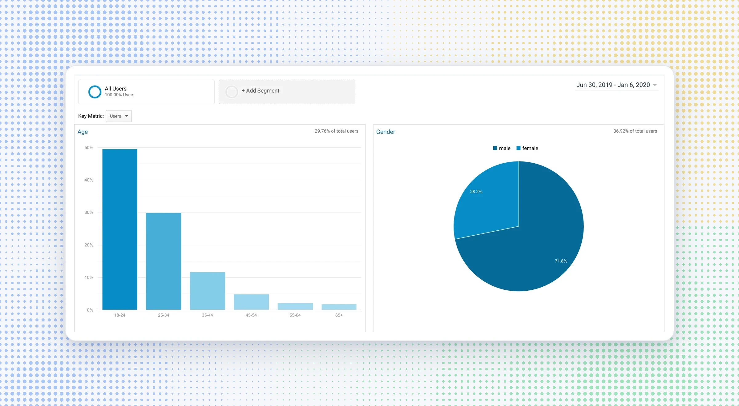
Analytics showed the core age groups and interest segments most likely to adopt it. User interviews and observation sessions then showed how gamers use emulators, what frustrates them and what they value most.
01
Quantitative
Demographics and interest segments from analytics narrowed down the target audience.
02
Qualitative
Interviews and observation sessions uncovered needs, pain points and motivations.
03
What we set out to measure
Successful downloads, how easily people find games, the most searched features, and how people engage with blogs.
Where people dropped off
Following the path to download
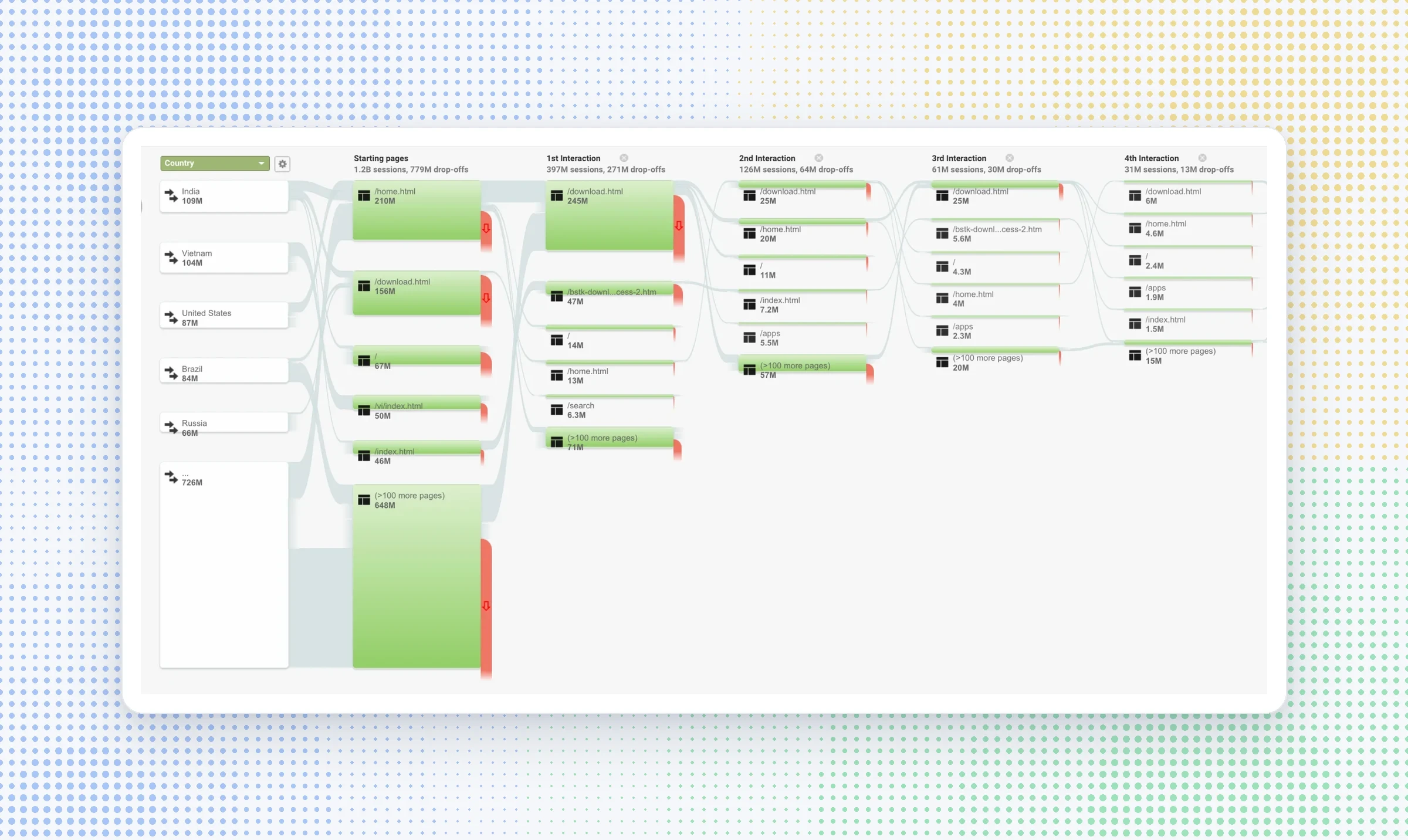
I mapped how visitors moved through the site and where they left. The funnel showed which pages led people to download and which ones pulled them away.
Key decisions
What the research told us to change
01
Keep the download in reach
A download button stays on screen on every page, because getting App Player is the main job of the site.
02
Say what BlueStacks is
A clear tagline and explainer communicate the value straight away.
03
Give the App Center its own space
Games moved out of the main pages into a dedicated area, so they stopped cluttering everything else.
04
Write for scanning
Content is cut to three lines with "Read more", to match how people actually read the site.
05
Search that knows what you want
Results are grouped into apps, games, blogs and features, so people can tell them apart.
06
One consistent system
A style guide brings familiarity across pages and keeps future updates consistent.
Structure
A simpler map of the site
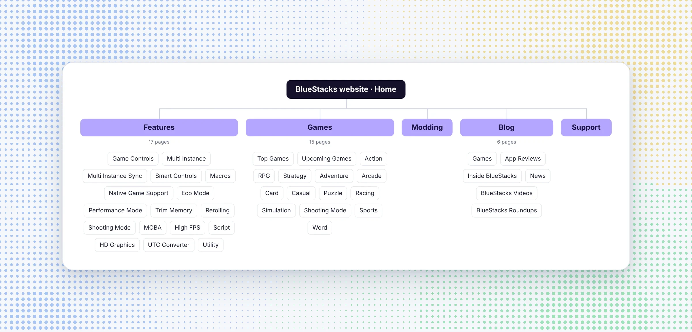
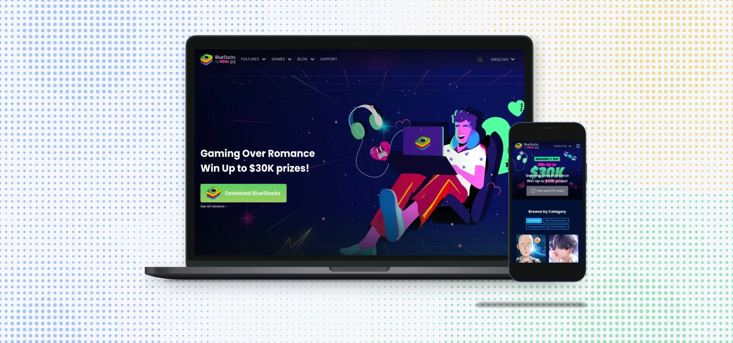
I rebuilt the information architecture around five clear sections: features, games, modding, blog and support. Each kind of content has one home, and the path to download stays short from any of them.
Design
From wireframes to the final site
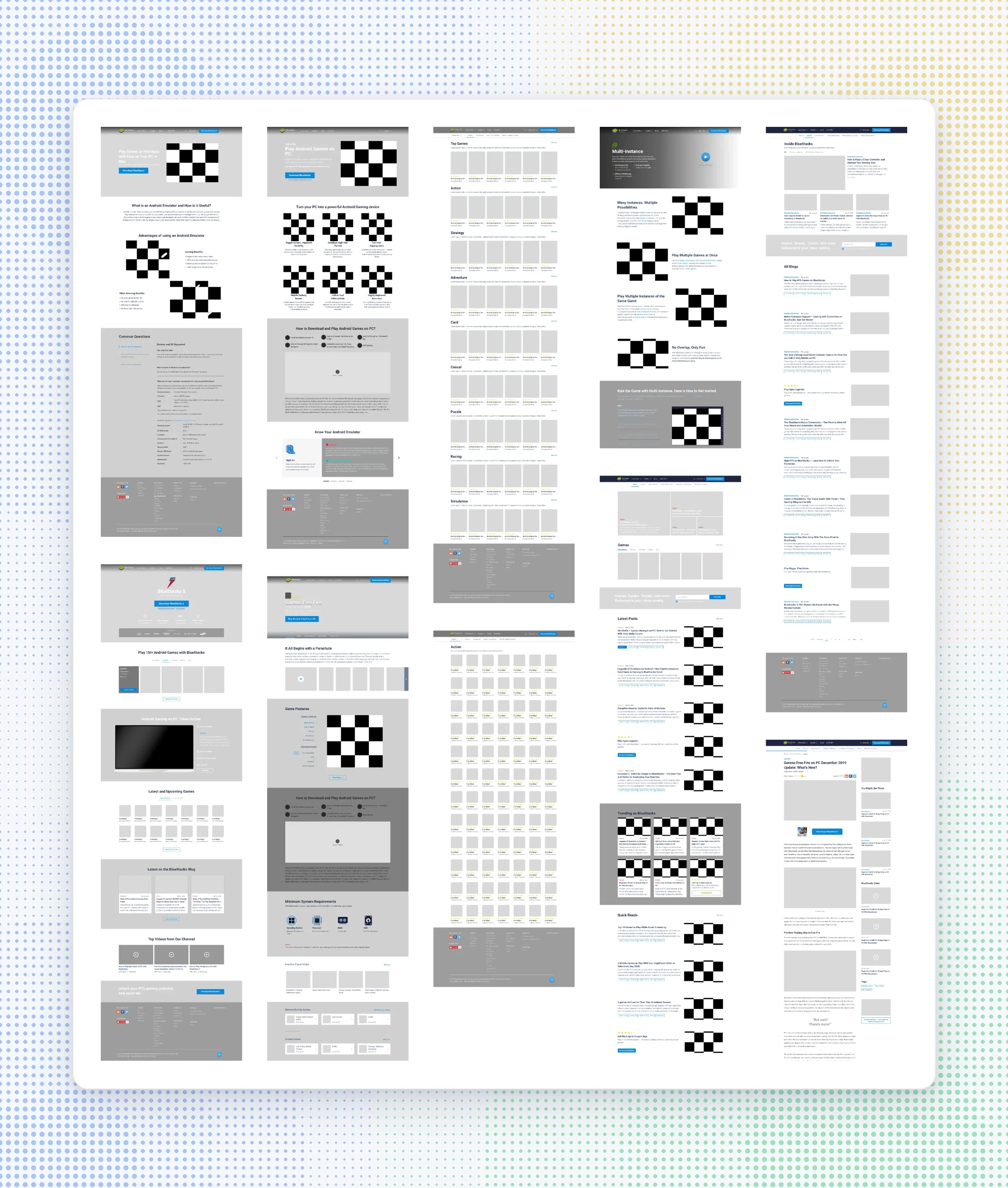
I wireframed every key page before moving to UI, then built the style guide alongside the final designs so the team could keep the site consistent after launch.
Impact
More downloads, happier visitors
For users
- Less to wade throughSimpler pages and shorter content made the site less overwhelming. Time spent on the site went up 84%.
- Easier to find gamesA dedicated App Center and grouped search made games easier to find.
- Higher satisfactionUser satisfaction ratings went up from 3.2 to 4.2 stars.
For BlueStacks
- More downloadsNew App Player downloads went up 32% within six months of launch.
- Better retentionUser retention went up 25%.
- A system to build onThe style guide kept later updates consistent, including the BlueStacks 4 and BlueStacks X launches.
Reflection
Looking back
What this proved
- Giving the site one job, the download, and keeping it in reach on every page was the change that mattered.
- Writing for scanning works: people stayed longer when there was less to read.
Next case study